

Your brand deserves better than last year's color palette.
If your custom t-shirts are still rocking the same shades from 2024, you're blending into the background. Consumer preferences have shifted dramatically. Bold, confident colors are dominating the apparel landscape. And niche aesthetic trends are separating the memorable brands from the forgettable ones.
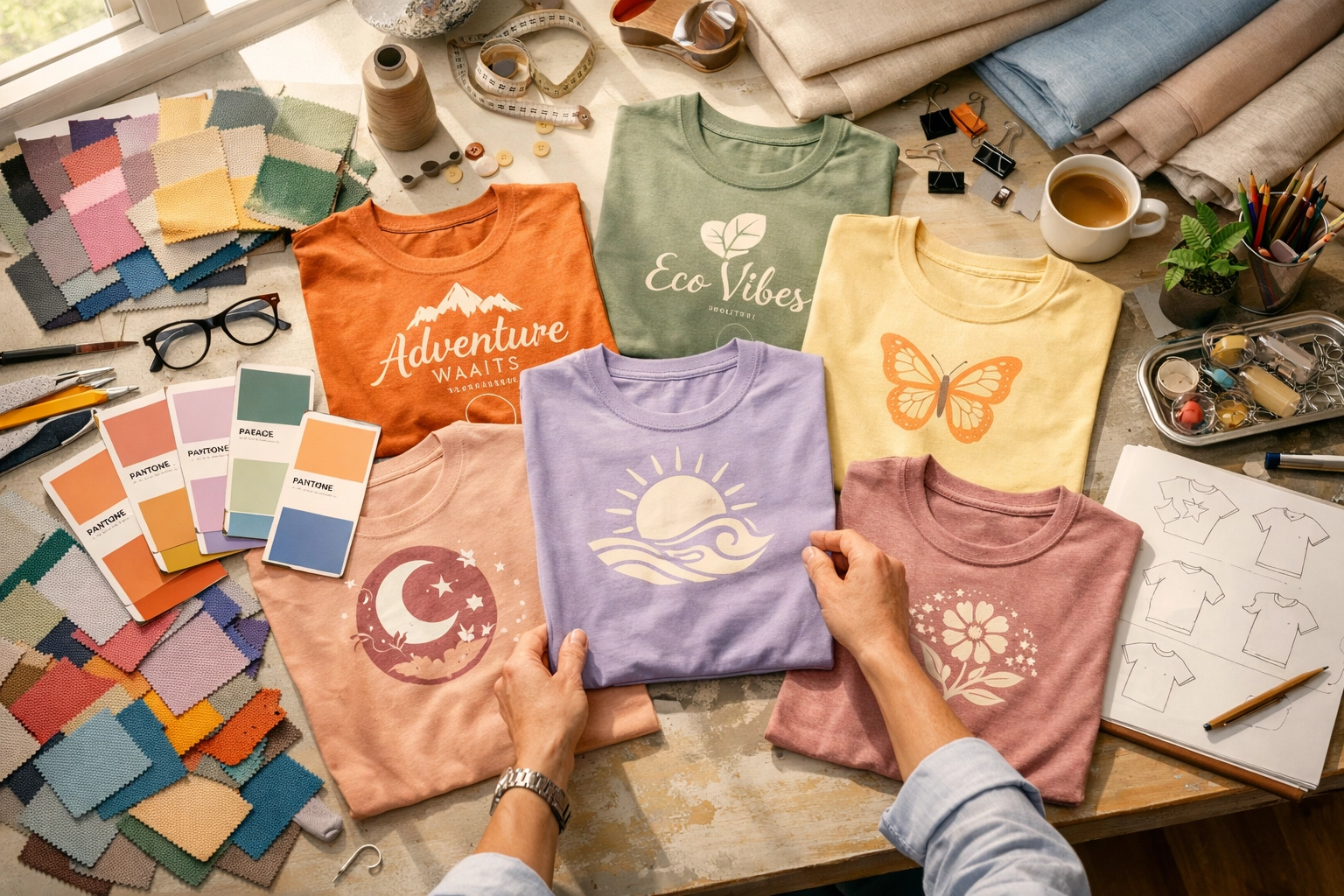
Spring 2026 is the perfect time to refresh your approach to custom t shirt printing. Let's explore why color matters more than ever and which trending palettes will make your brand stand out.
Why Your Color Choices Actually Matter
Color isn't just decoration. It's communication.
The right palette creates emotional connections with your audience. It differentiates your brand in crowded markets. And it drives purchasing decisions faster than you might think.
2026 is making room for bold color moments. Safe, muted palettes are taking a backseat to vibrant, personality-driven designs. Customers want authenticity. They want visual statements. They want collectible pieces that feel special.
Brands clinging to outdated color schemes risk becoming invisible. Those embracing current trends capture attention immediately and build lasting cultural relevance.
The Dominant Color Trends for 2026
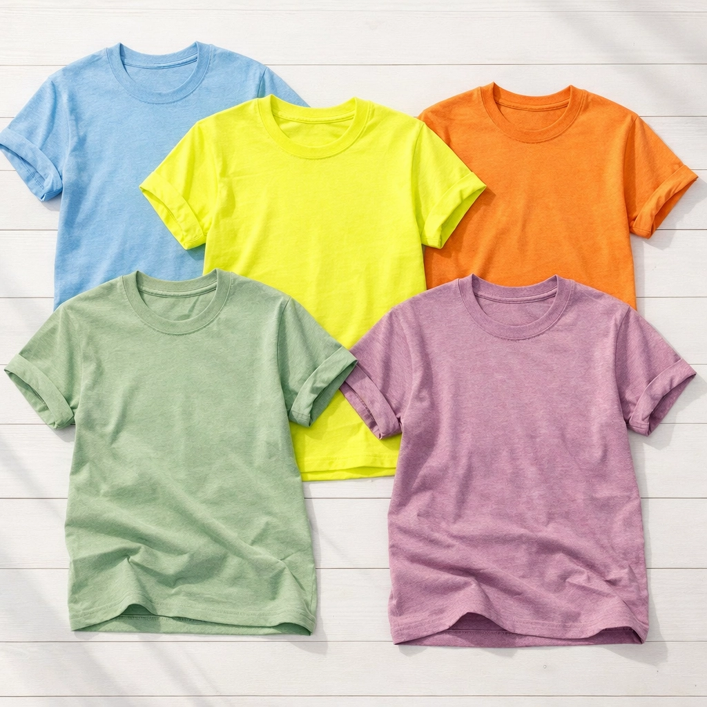
Cool-Toned Palettes Lead the Charge
Glacier Blue is everywhere right now. Think icy, frosted hues that evoke calm and clarity. Soft blues, muted aquas, and frosted silvers create sophisticated designs that feel fresh and modern.
Heather Ice Blue and Heather Sea Green offer incredible versatility for nature-inspired designs. Coastal brands especially benefit from these cool tones. They photograph beautifully and pair well with screen printing techniques that require high contrast.
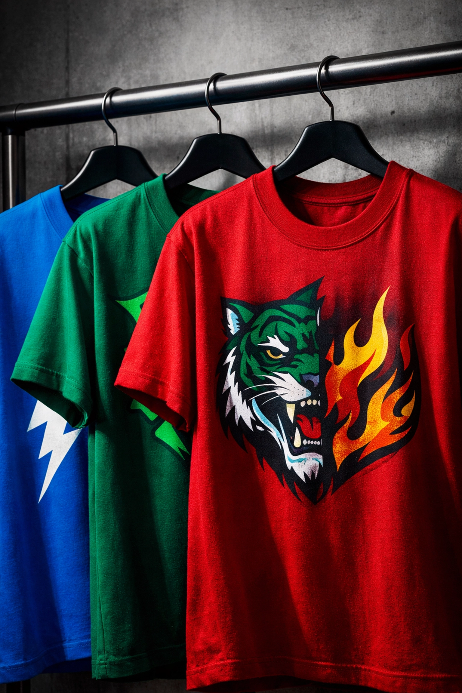
Vibrant & Saturated Hues Make Statements
Bold is back. Rich blues, vibrant greens, and saturated reds create high-impact designs that demand attention.
Neon Blue brings electrifying energy to statement pieces. Banana Yellow adds unexpected warmth. Tangerine Disco and Neon Shock work perfectly for brands targeting younger, energy-driven audiences.
When you're searching for "screen printing near me," ask about their capability with vibrant inks. Not all shops handle saturated colors equally. The right custom t shirt printing partner makes all the difference in achieving true color accuracy.
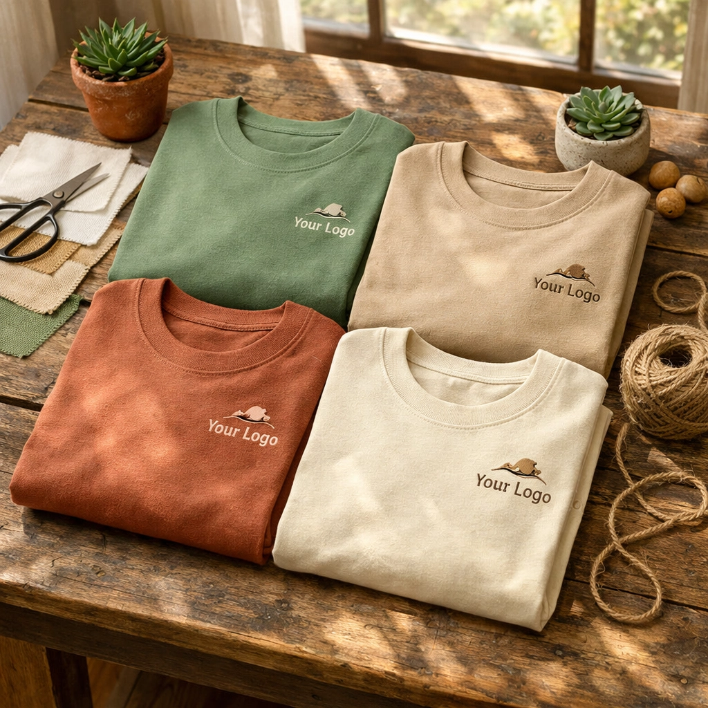
Earthy & Sustainable Tones Reflect Values
Green and sandy beige are among the most popular colors in 2026. This shift reflects growing consumer demand for sustainable aesthetics.
Soft greens, browns, and neutrals pair beautifully with eco-friendly fabrics. Organic cotton tees look stunning in these earth-conscious shades. Minimalist designs in sustainable tones communicate brand values without saying a word.
Consider the Comfort Colors Heavyweight Ring-Spun Tee in earthy shades. The vintage feel and sustainable messaging align perfectly with this trend.
Alternative Aesthetics Create Emotional Depth
Dark Romantic palettes are capturing alternative fashion audiences. Deep purples, smoky blacks, and glossy highlights create mystery and emotional resonance.
Color Escapism uses bright, expressive palettes and warm gradients for optimistic, human-centered visuals. These approaches work particularly well for limited drops and collectible merchandise.
Nuanced Neutrals Offer Sophistication
Heather variants remain essential. Athletic Heather, Dark Grey Heather, Heather True Royal, Heather Slate, Heather Mauve, and Heather Lapis offer texture and depth while maintaining broad appeal.
These sophisticated neutrals work as foundation pieces in any collection. They're versatile enough for corporate orders and stylish enough for retail lines.
How to Choose Your Perfect Palette
Match Colors to Your Brand Identity
Tech-driven brands benefit from neon and glitch aesthetics. Eco-conscious labels thrive with earthy tones and sustainable color stories. Lifestyle brands often embrace cool-toned palettes with heather variations.
Your color choices should reinforce what your brand stands for. Don't chase every trend. Select the palettes that authentically represent your values and resonate with your specific audience.
Strategic Color Combinations Win
White and black provide high contrast for bold designs. They're timeless for a reason. But don't stop there.
Creamy oats paired with cool peppermints offer softer, refined alternatives. Deep purples with frosted silvers create sophisticated contrast. Vibrant greens with sandy beiges balance energy with earthiness.
Test combinations before committing to large production runs. Order samples. See how colors interact in real life, not just on screens.
Consider Your Printing Method
Screen printing handles vibrant colors beautifully. It's perfect for bold, saturated hues and high-volume orders. DTG (direct-to-garment) printing excels with detailed, multicolor designs and smaller batches.
Discharge techniques create vintage, soft-feel prints in lighter shades. They work wonderfully with earthy, sustainable tones on darker garments.
Not sure which method suits your color choices? That's what experienced custom t shirt printing professionals help you navigate. We test color combinations across different techniques to ensure your vision translates perfectly to the final product.
Ready to Refresh Your Brand?
Start With a Color Audit
Look at your current apparel lineup. Which colors are you using? How long have they been in rotation? Do they align with 2026 trends and your brand positioning?
Identify which pieces need immediate updates and which can stay. Sometimes a refresh means adding new options rather than replacing everything.
Experiment With Limited Releases
Test new colors through small drops or seasonal releases. This approach minimizes risk while gathering customer feedback. Limited editions create urgency and allow you to gauge response before full-scale production.
Partner With Experienced Printers
Quality matters. Color accuracy matters. Consistency matters.
When searching for "screen printing near me," look beyond just location. Ask about color matching capabilities. Request samples of vibrant and saturated hues. Check reviews specifically mentioning color quality.
At Truth Be Told Apparel, we specialize in bringing your color vision to life. Whether you're after glacier blues, neon statements, or earthy sustainable tones, we help you achieve perfect results.
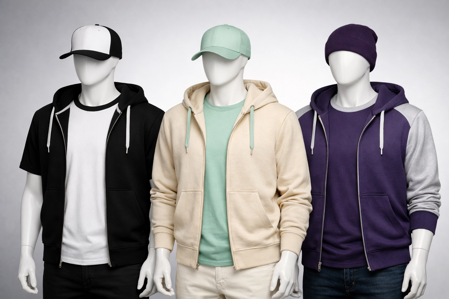
Think Beyond T-Shirts
Color refreshes extend to your entire merchandise line. Sweatshirts like the Comfort Colors Lightweight Crewneck Sweatshirt or the Gildan DryBlend Pullover Hooded Sweatshirt benefit equally from strategic color choices.
Even accessories like bags communicate your brand through color. Coordinated palettes across all products strengthen brand recognition and create cohesive visual identity.
Spring Into Action
2026 color trends offer incredible opportunities for brand differentiation. Cool-toned palettes provide sophistication. Vibrant hues create energy. Earthy tones communicate values. Alternative aesthetics build emotional connections.
Your custom t shirt printing strategy should evolve with these trends. Not every palette fits every brand. But the right refresh at the right time captures attention and drives engagement.
Spring cleaning isn't just for closets. It's for brands ready to stand out.
We are here to help you navigate color selection, test combinations, and produce stunning custom apparel that reflects current trends while staying true to your brand identity. Free consultations. Expert guidance. Quality results.
Ready to refresh your palette? Let's create something remarkable together.

